Supreme Strength - Logo redesign
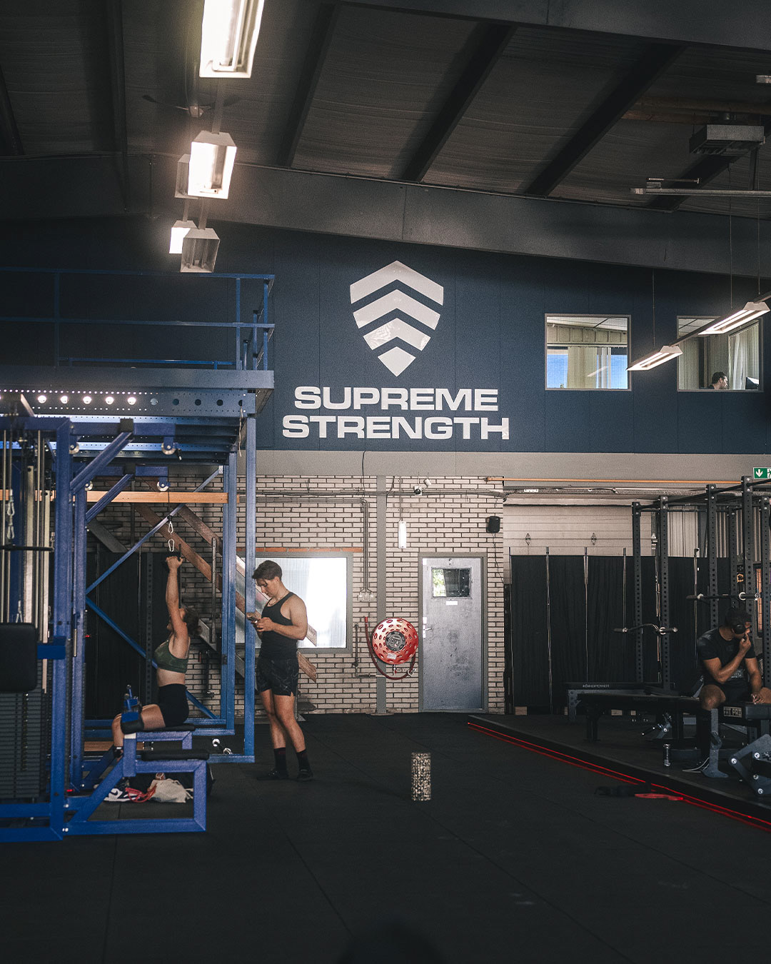
Some time ago, the people from Supreme Strength Coaching approached me with the request to develop a new logo for their coaching service. Additionally, the logo was also to be used for the new gym they are opening in The Hague. Therefore, the logo needed to be broadly applicable.
Some time ago, the people from Supreme Strength Coaching approached me with the request to develop a new logo for their coaching service. Additionally, the logo was also to be used for the new gym they are opening in The Hague. Therefore, the logo needed to be broadly applicable.
"In terms of look, we want something that is sleek/clean and where the text 'Supreme Strength' is central. It should be recognizable and exude strength."
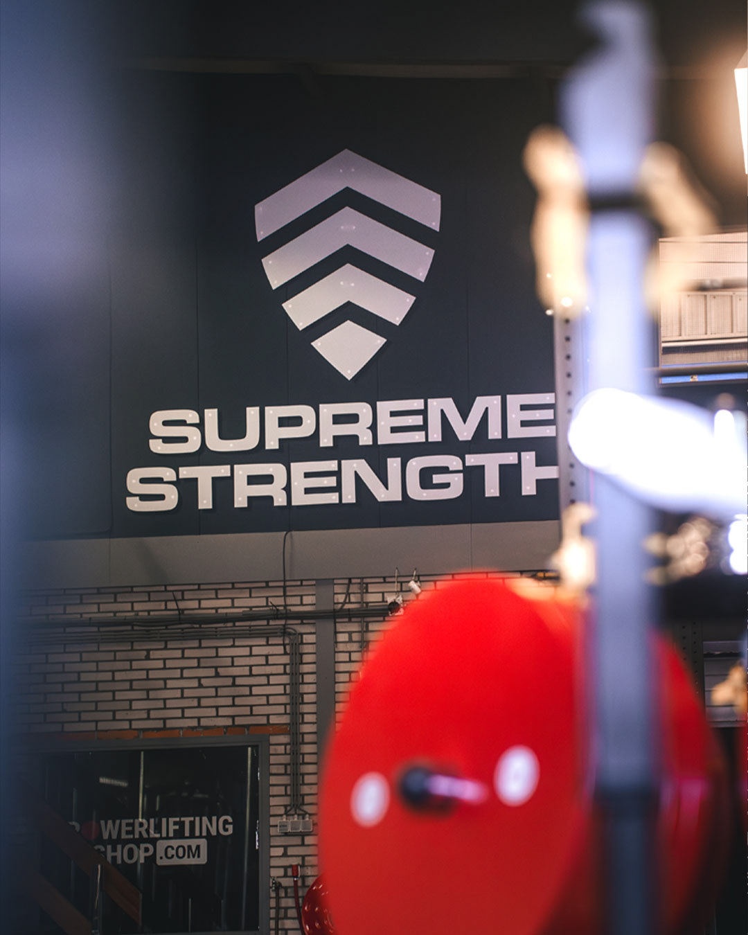
A fairly broad briefing that allows for quite a bit of creative freedom. With this briefing in mind, I got to work. I decided to use the existing emblem as a basis. The shield has been the recognizable icon in the overall logo for some time. I built upon the word "supreme," which essentially means "high in rank." The definition of this word can be interpreted broadly, but generally, it evokes an impression of always striving to excel in strength and becoming the best you can possibly be.
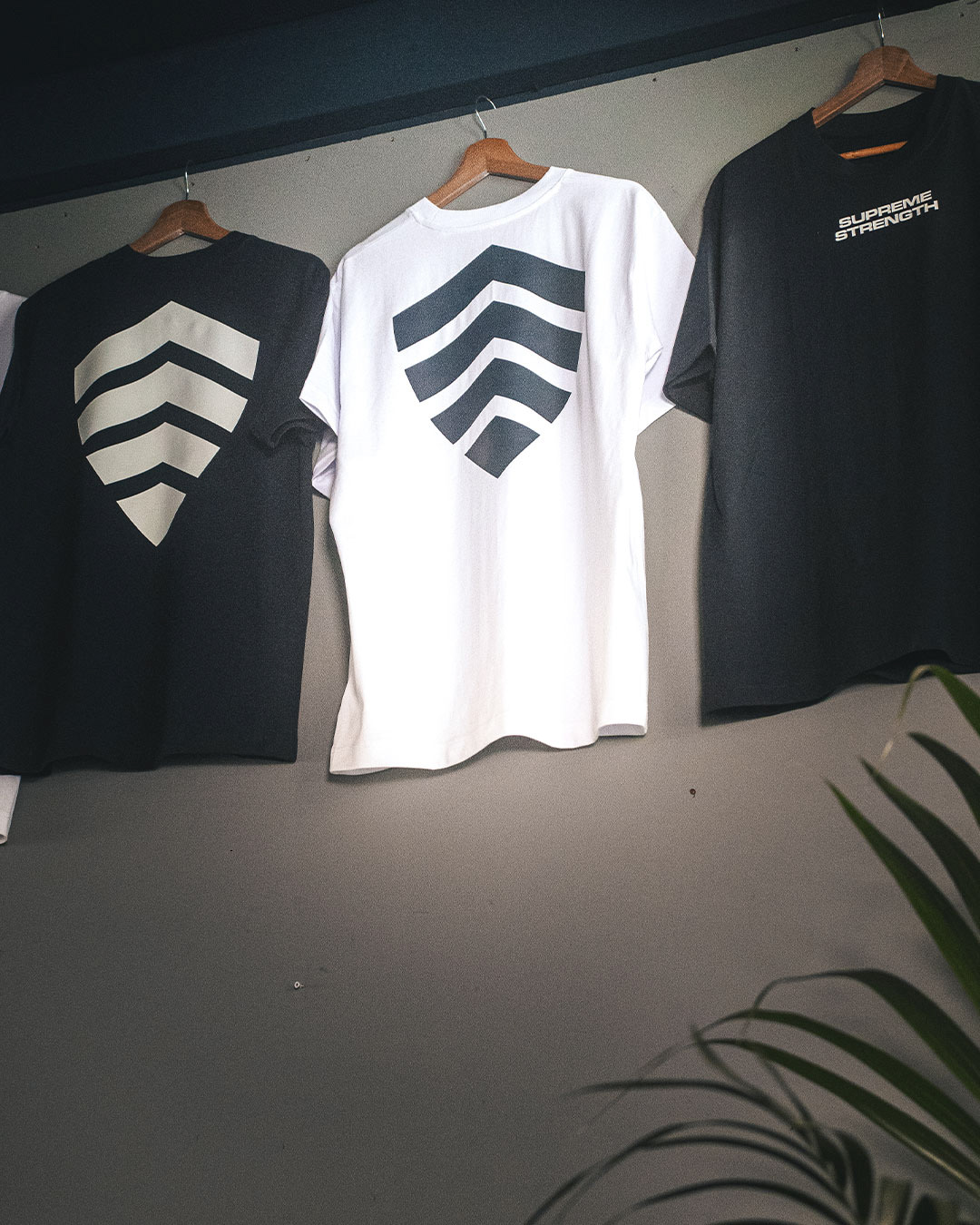
I tried to encapsulate the word "supreme" in a recognizable icon. I quickly arrived at the familiar icon with three upward-pointing stripes. I combined this with the shield and shaped it into arrows to create a more cohesive whole.
Regarding the typography, it was important that it be bold, timeless, and powerful. It needed to enhance the emblem and blend seamlessly with it.
A fairly broad briefing that allows for quite a bit of creative freedom. With this briefing in mind, I got to work. I decided to use the existing emblem as a basis. The shield has been the recognizable icon in the overall logo for some time. I built upon the word "supreme," which essentially means "high in rank." The definition of this word can be interpreted broadly, but generally, it evokes an impression of always striving to excel in strength and becoming the best you can possibly be.
I tried to encapsulate the word "supreme" in a recognizable icon. I quickly arrived at the familiar icon with three upward-pointing stripes. I combined this with the shield and shaped it into arrows to create a more cohesive whole.
Regarding the typography, it was important that it be bold, timeless, and powerful. It needed to enhance the emblem and blend seamlessly with it.
Photos by Jesse Blaauw
@media_for_all
@media_for_all
2to1 Coaching - Logo
The boys from 2To1 coaching approached me via Instagram to develop a visual identity for their powerlifting coaching service. The name 2To1 represents the concept of two coaches training individuals, two on one. The three parallel stripes, with one filled, illustrate this idea, also symbolizing the three lights in powerlifting where two white lights indicate a good lift. These elements are arranged to also suggest a progressive bar chart icon. Combined with the typography, the design conveys a progressive, athletic, and powerful look.
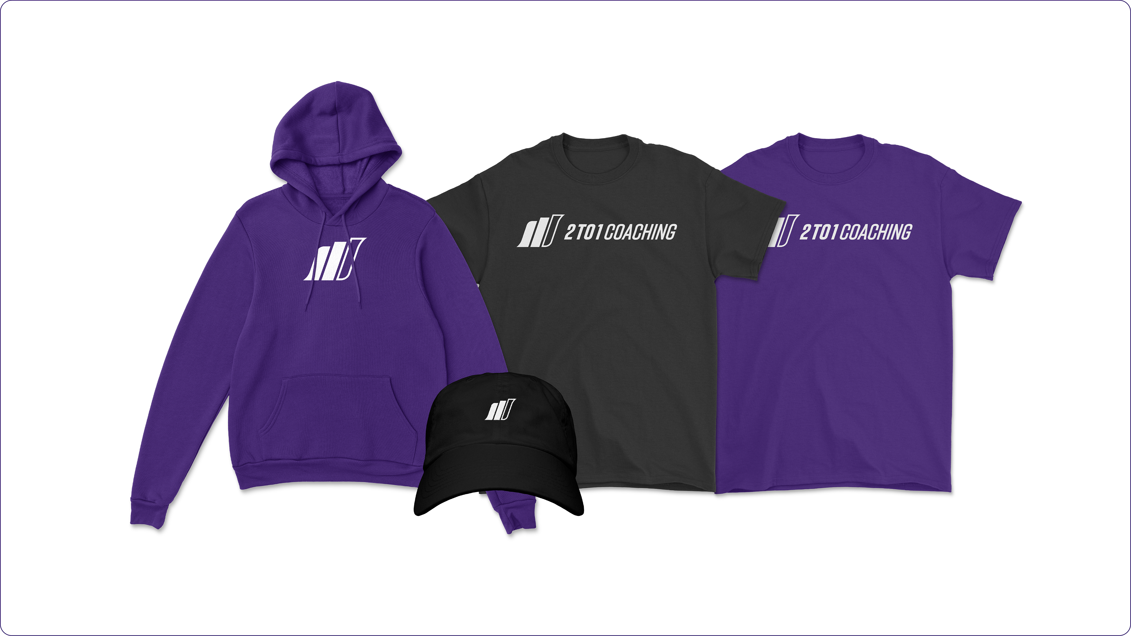
For the development of the logo, it was important that it be applicable to various mediums. As a coaching company, the coaches also need to be recognizable at powerlifting competitions. The emblem ensures extensive applicability, which is well demonstrated in the final image.
Revive Performance - Logo
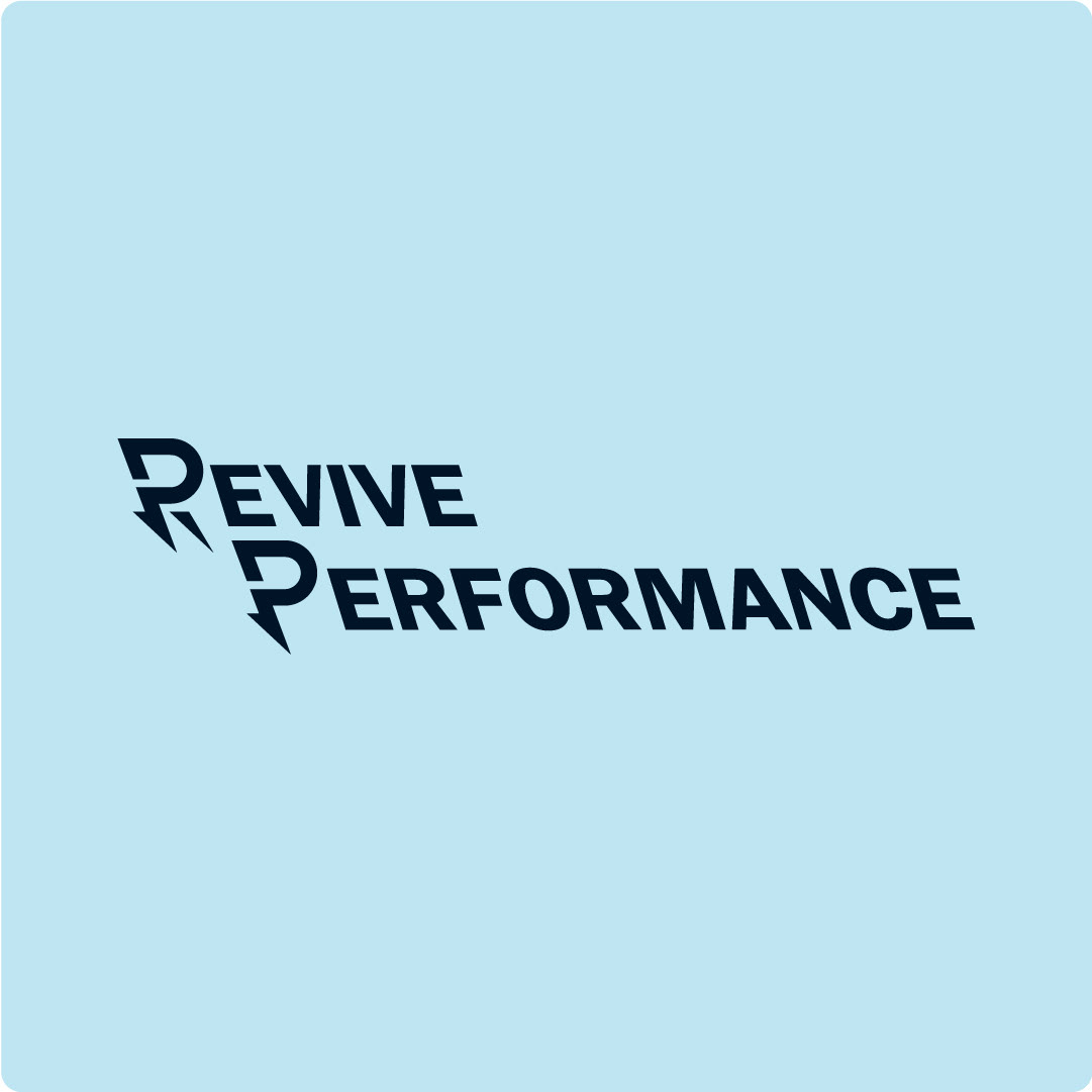
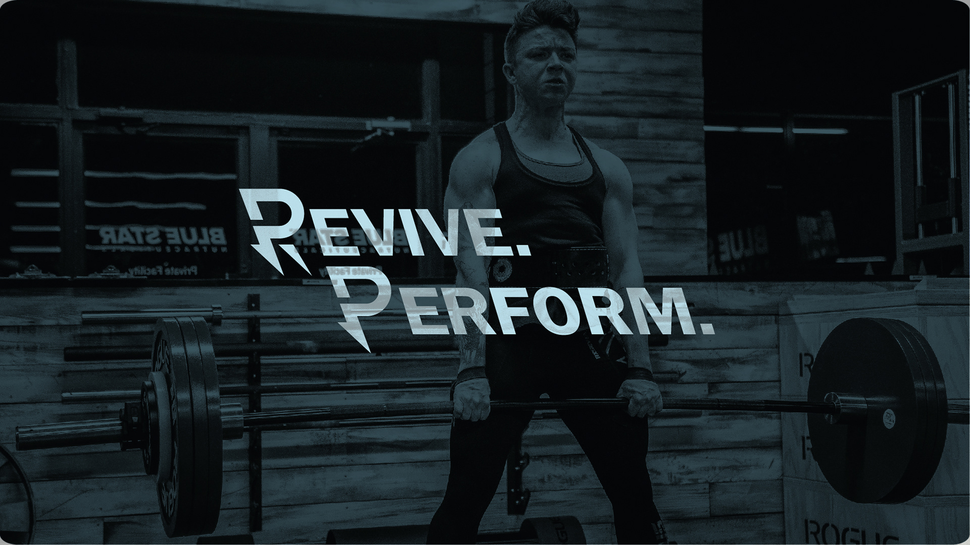
Mark approached me for a logo for his coaching company. Mark is a physiotherapist and combines this with coaching. His ambition is to empower people from their pain complaints. "Revive," which literally means "to revive," in this context signifies that the athlete can make progress again despite their pain complaints.
Mark approached me for a logo for his coaching company. Mark is a physiotherapist and combines this with coaching. His ambition is to empower people from their pain complaints. "Revive," which literally means "to revive," in this context signifies that the athlete can make progress again despite their pain complaints.
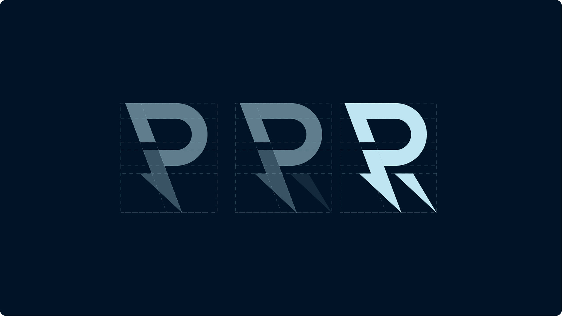
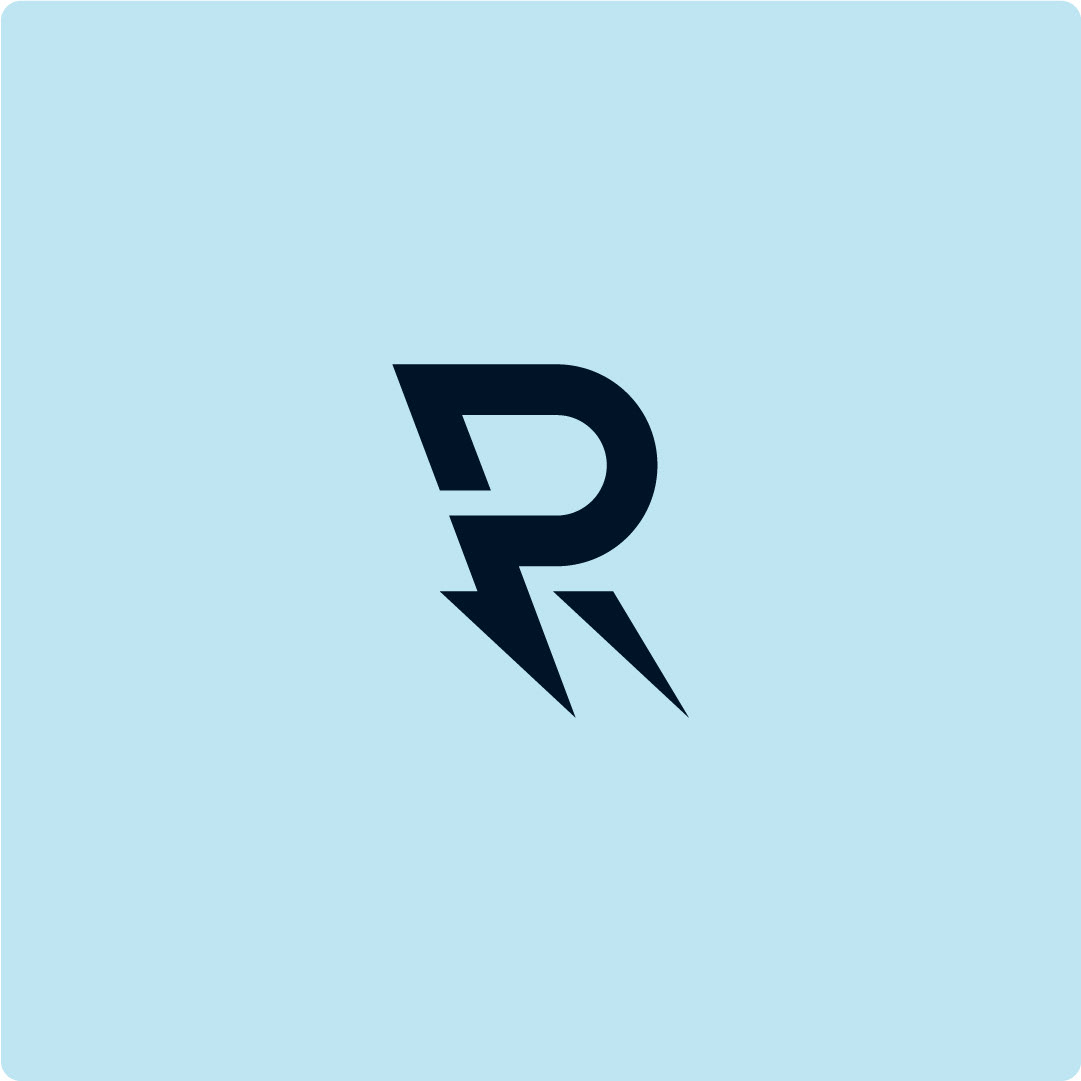
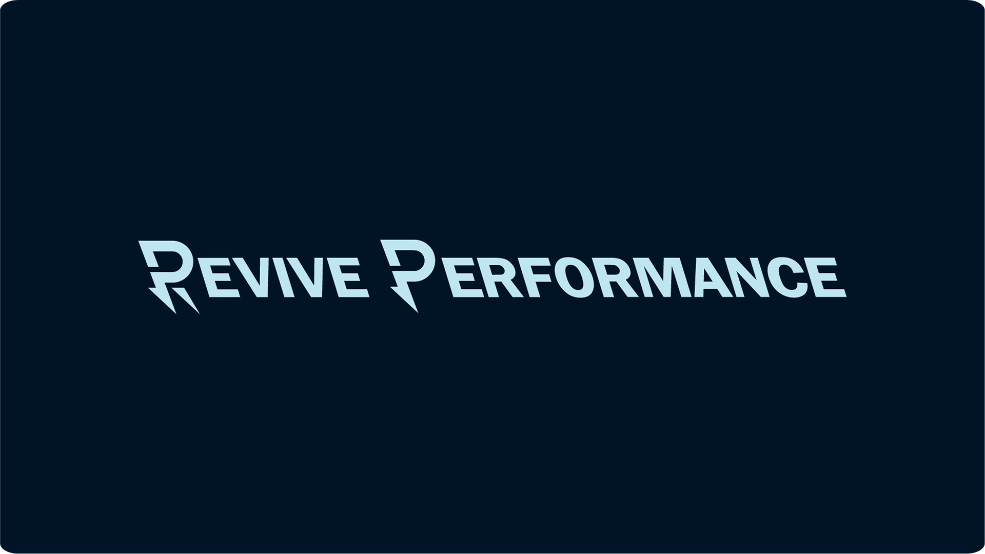
The logo is constructed from the "R" and "P" in Revive Performance. Additionally, there's the concept of a lightning bolt integrated into the tail of the letter. This symbolizes the strength and revival the athlete undergoes during their rehabilitation to move forward again. The logo uses the letters that form this emblem separately.
Better Lovers (band) - Logo & merchandise proposal
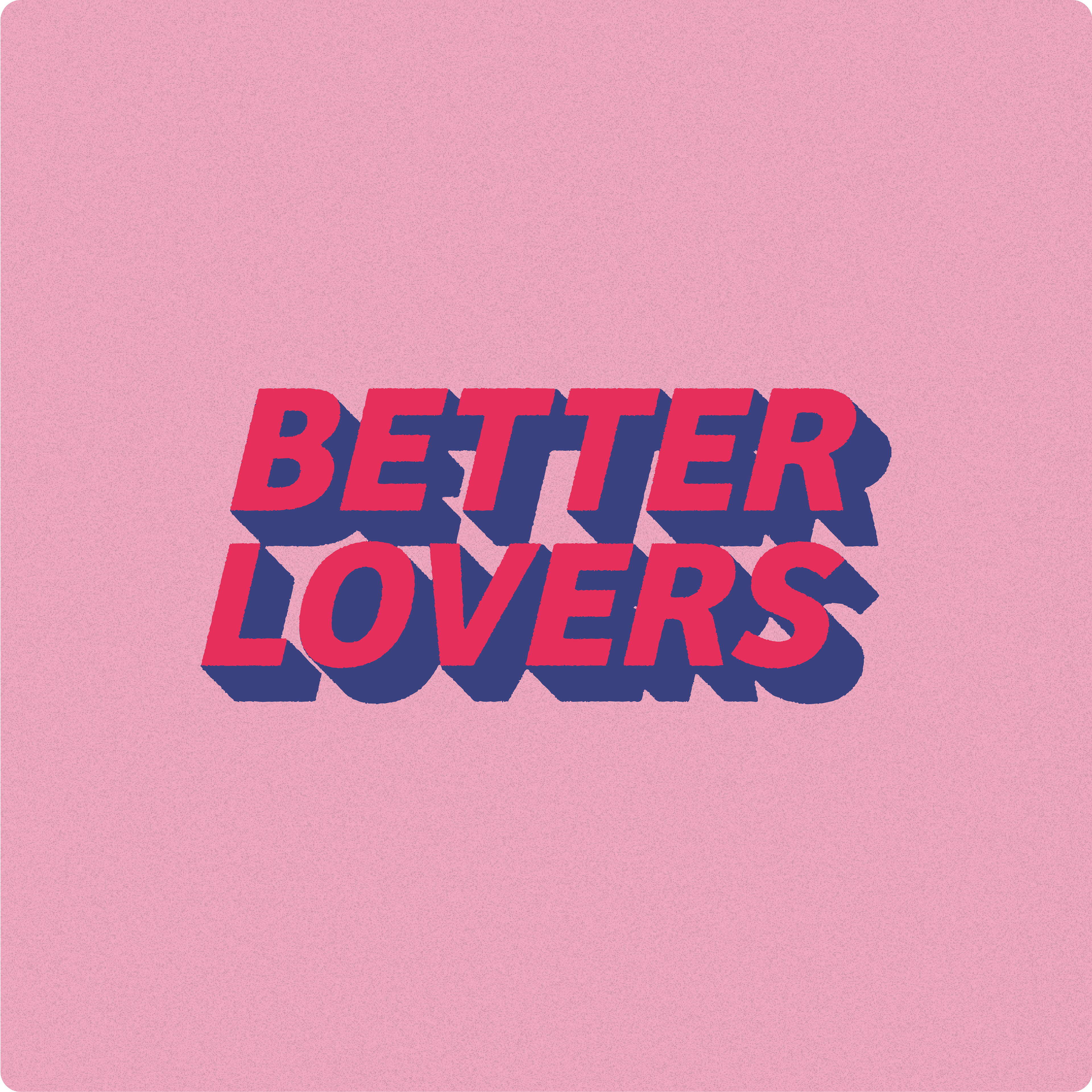
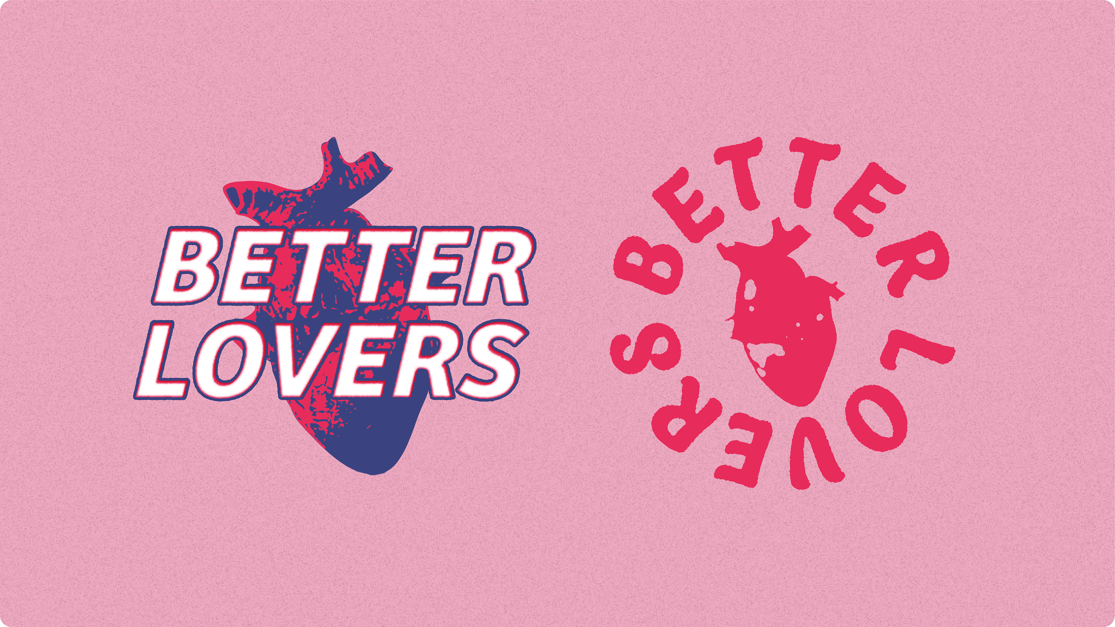
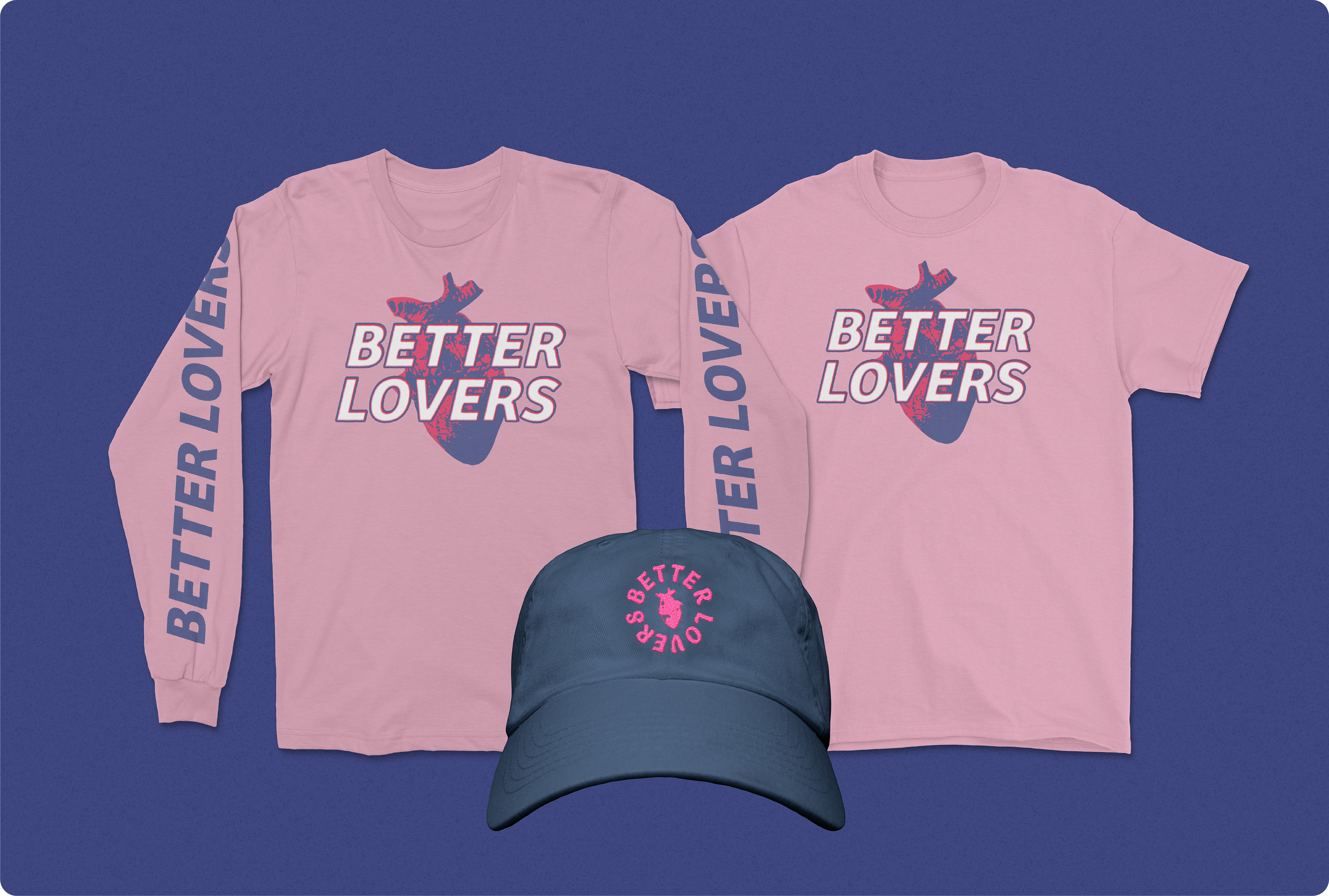
Here's the logo/merchandise design I crafted for Better Lovers some time ago. The challenge was to create a visual identity that strayed from a heavy metal aesthetic. Instead, it needed to be adaptable, equally at home at Riotfest or Coachella as it would be at Furnace Fest. The goal was to achieve timelessness, ensuring the design could seamlessly navigate between different music scenes.
While my submission ultimately wasn't chosen, I thoroughly enjoyed the creative process and the opportunity to contribute to such a dynamic project.
Klasse
Commissioned by Lift3
Commissioned by Lift3
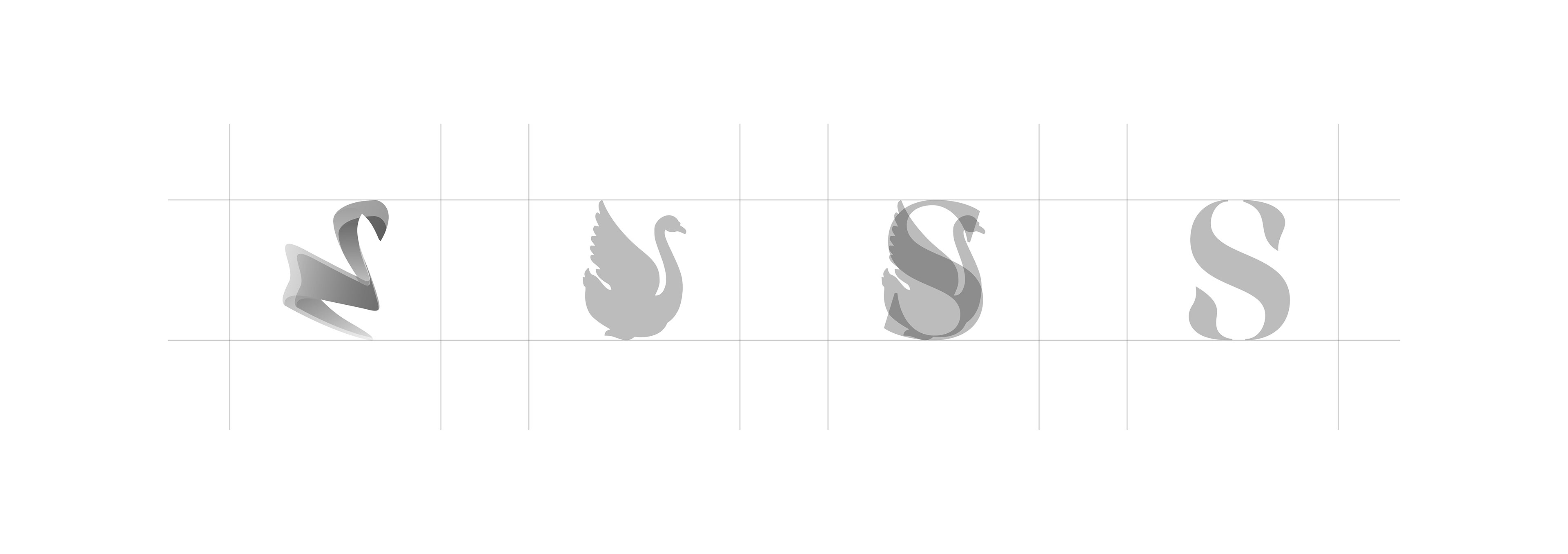
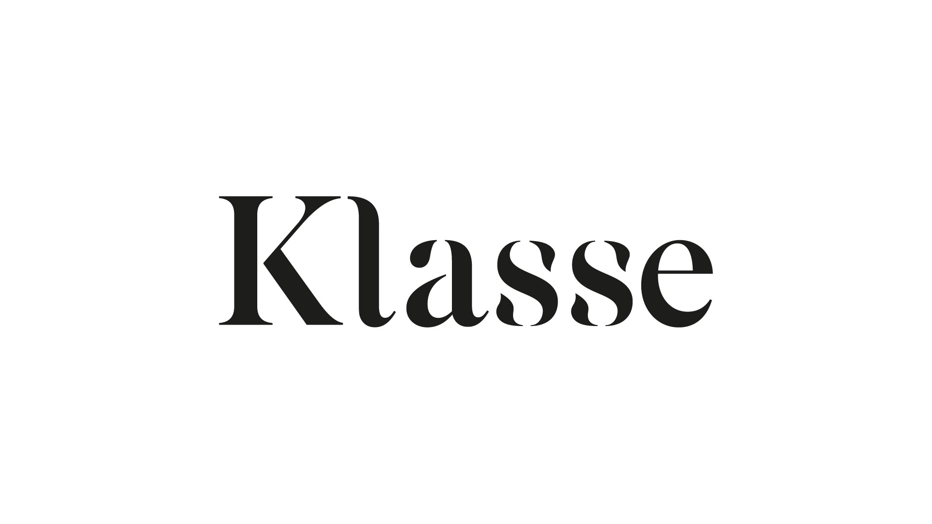
I had the opportunity to design a logo for the Klassetheater in Tilburg. The original logo featured an abstract swan as its symbol, which they wished to subtly incorporate. The logo is typographic in nature, crafted from a modified font where the swan is elegantly integrated into the letter 'S'.
The design not only needed to honor the theater's distinctive swan emblem but also reflect a modern aesthetic suitable for its cultural and artistic atmosphere. By carefully adjusting the typography and subtly incorporating the swan motif, a balanced and recognizable logo was created that effectively communicates the identity of the Klassetheater.