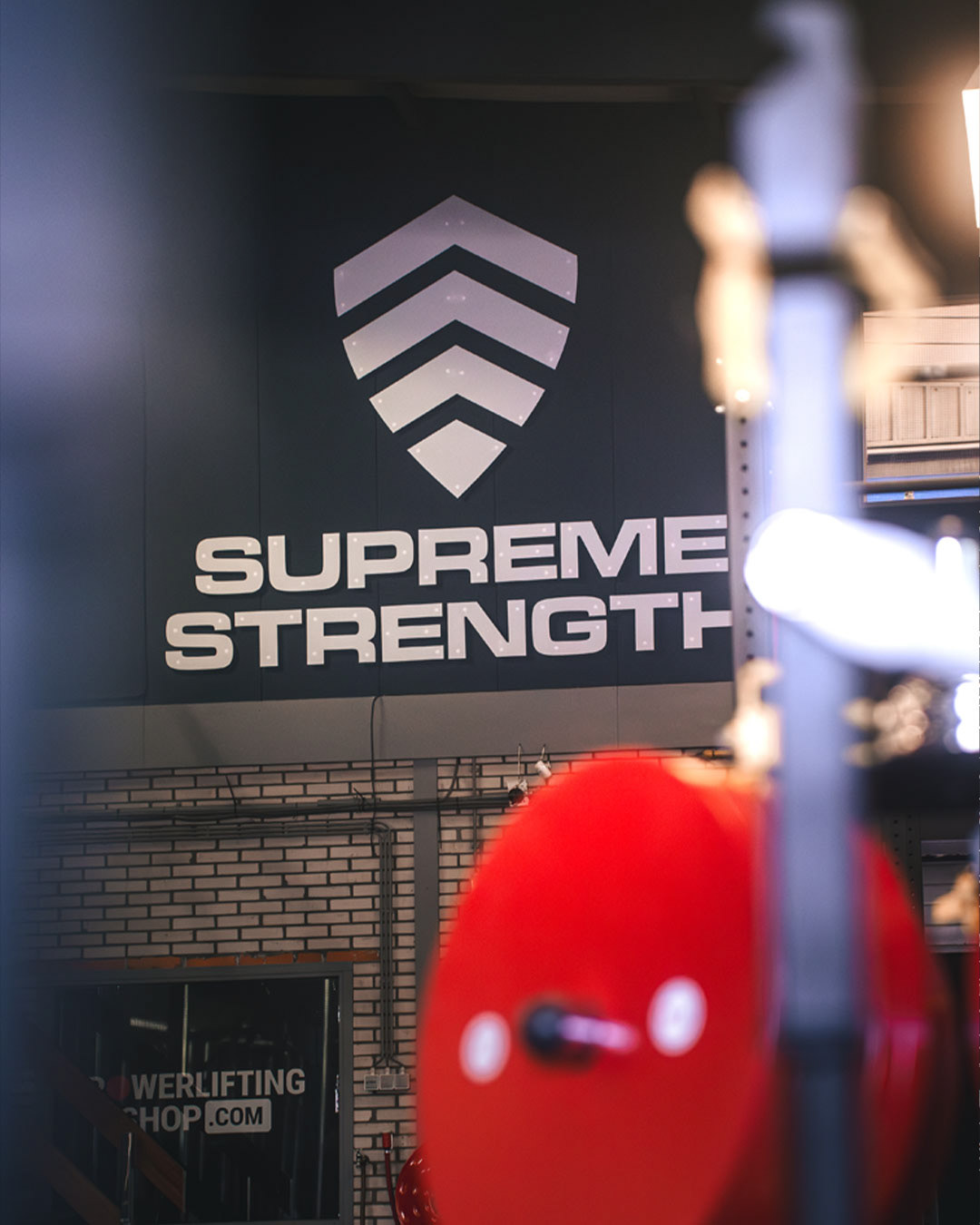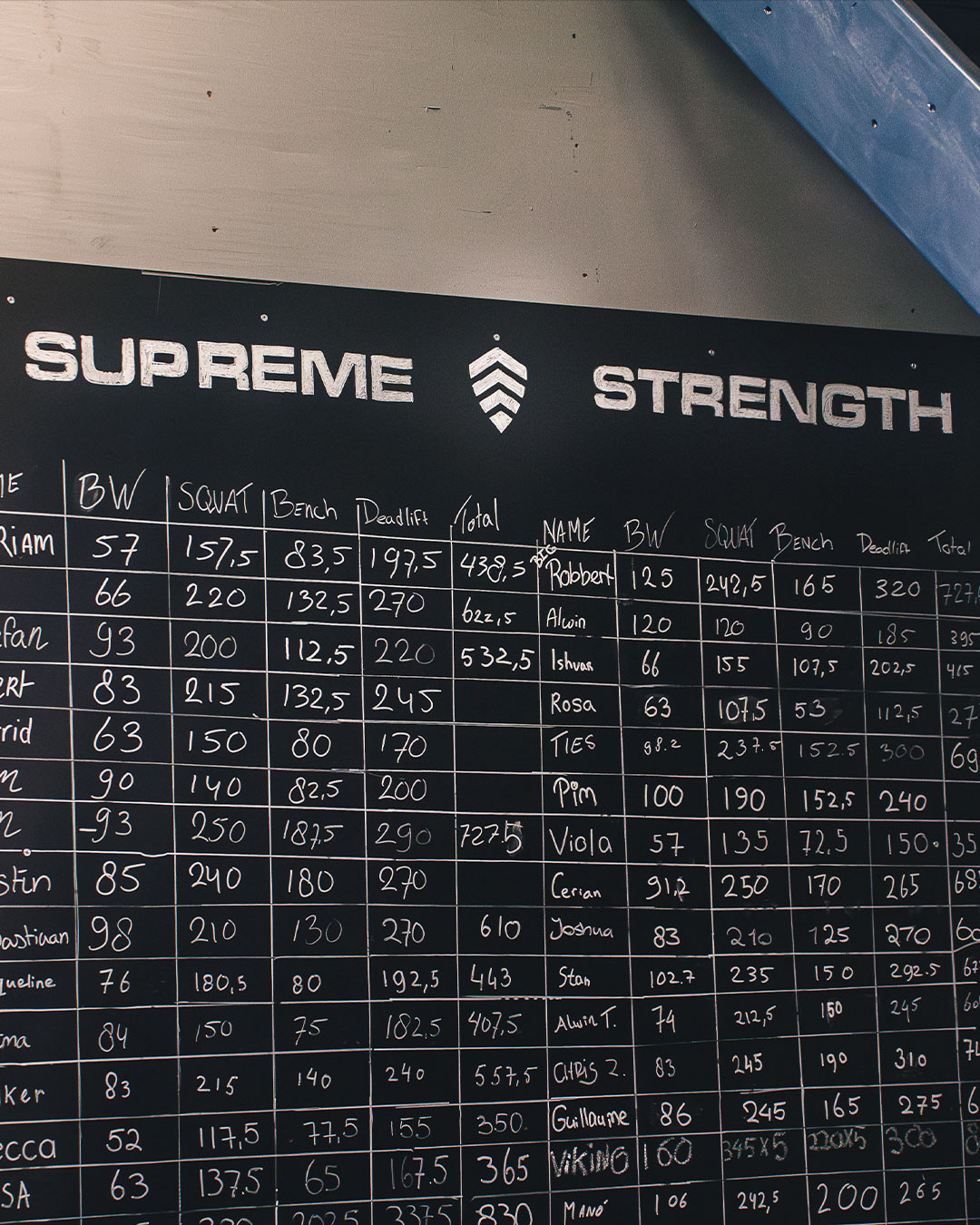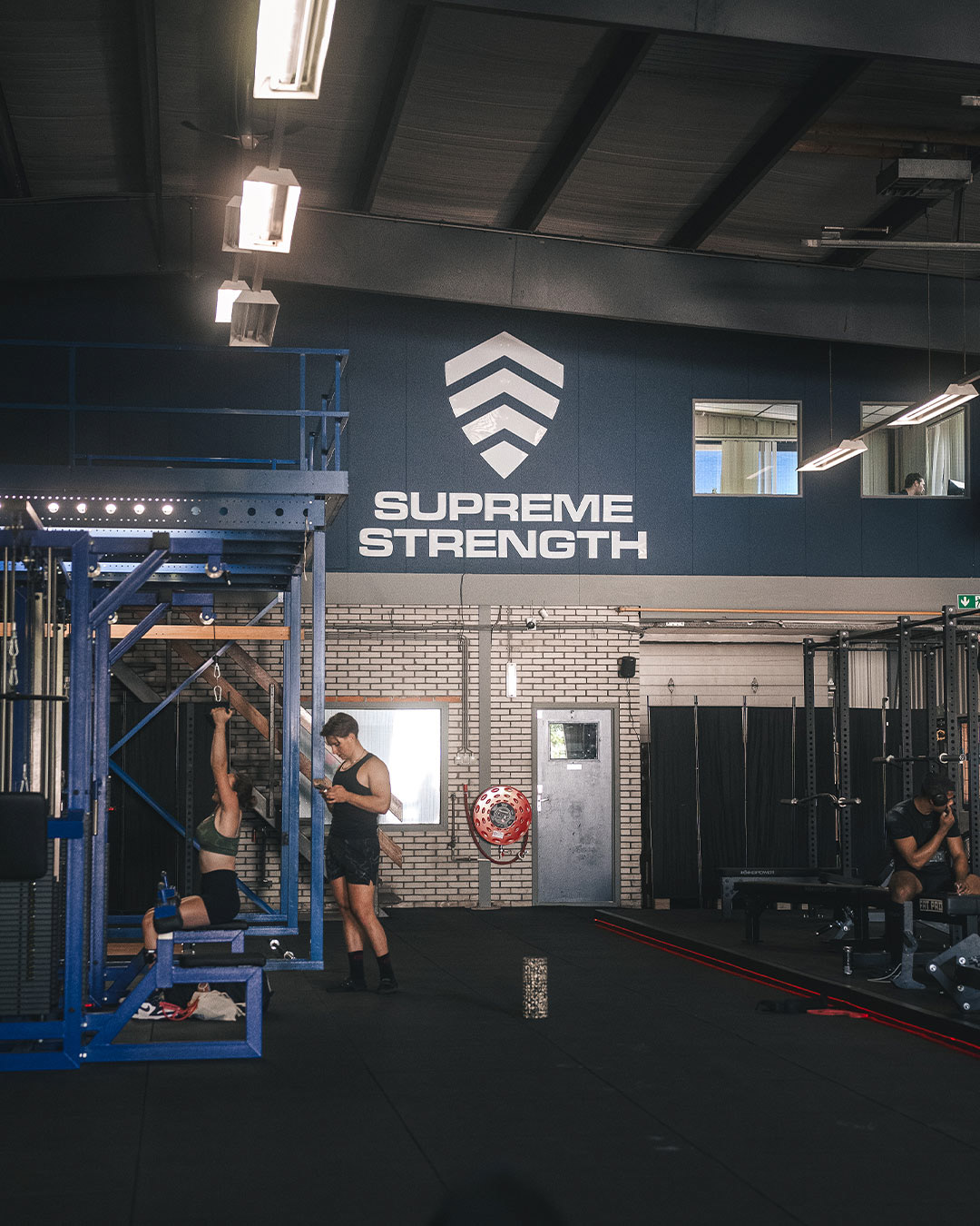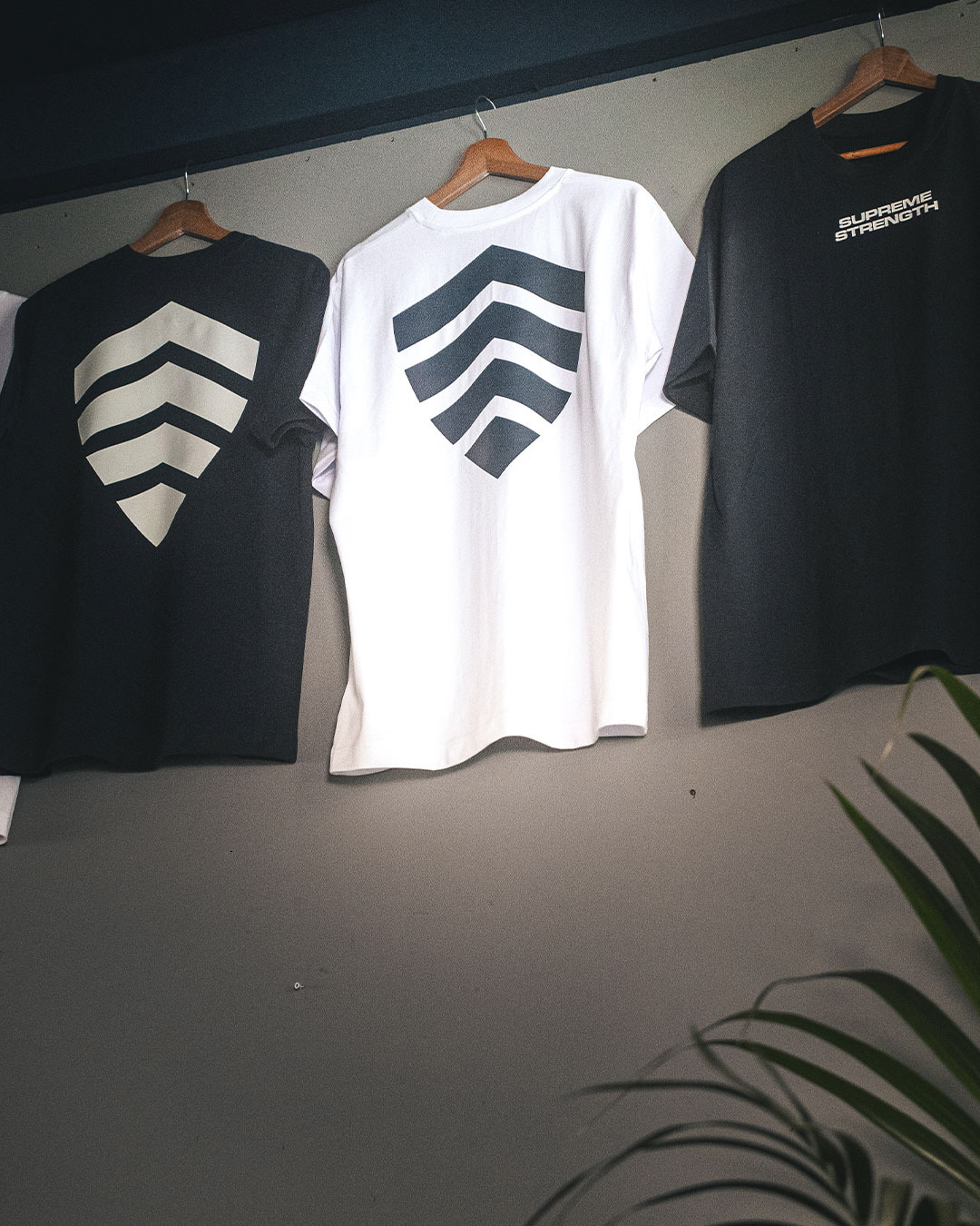
I'm very proud to have been a part of Supreme Strength right from the beginning. I reinvented their logo. That's where it started. I created a logo pack as I never deliver just one logo. A logo has to be able to evolve and be multifunctional. With that in mind, later came the merch.
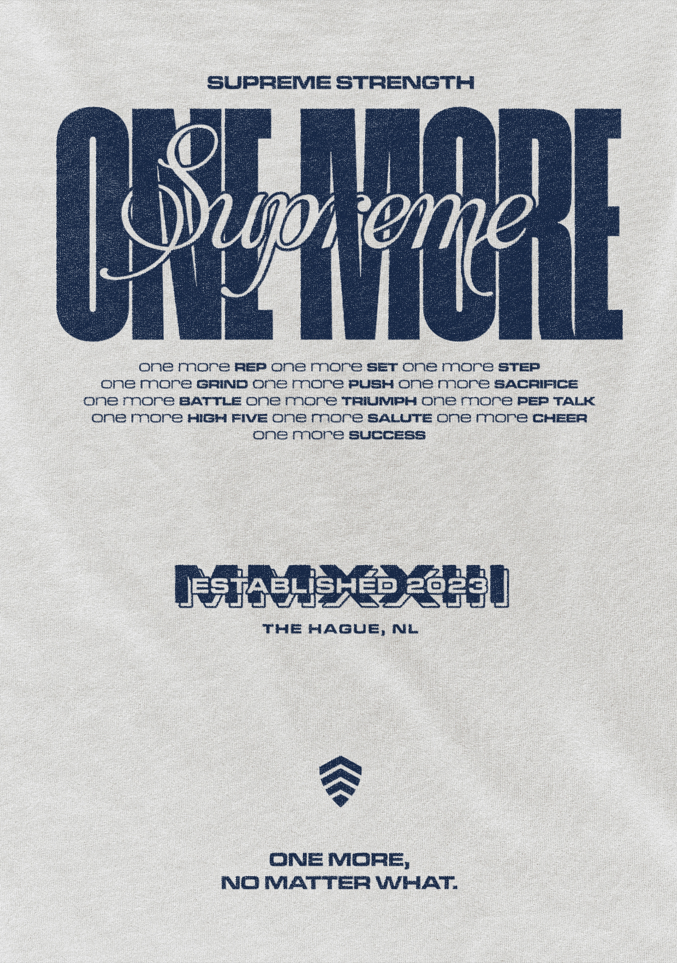
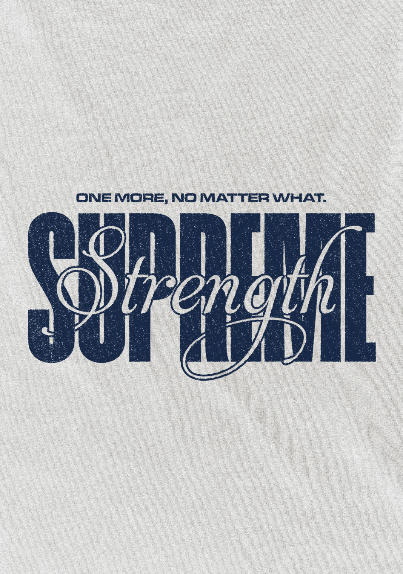
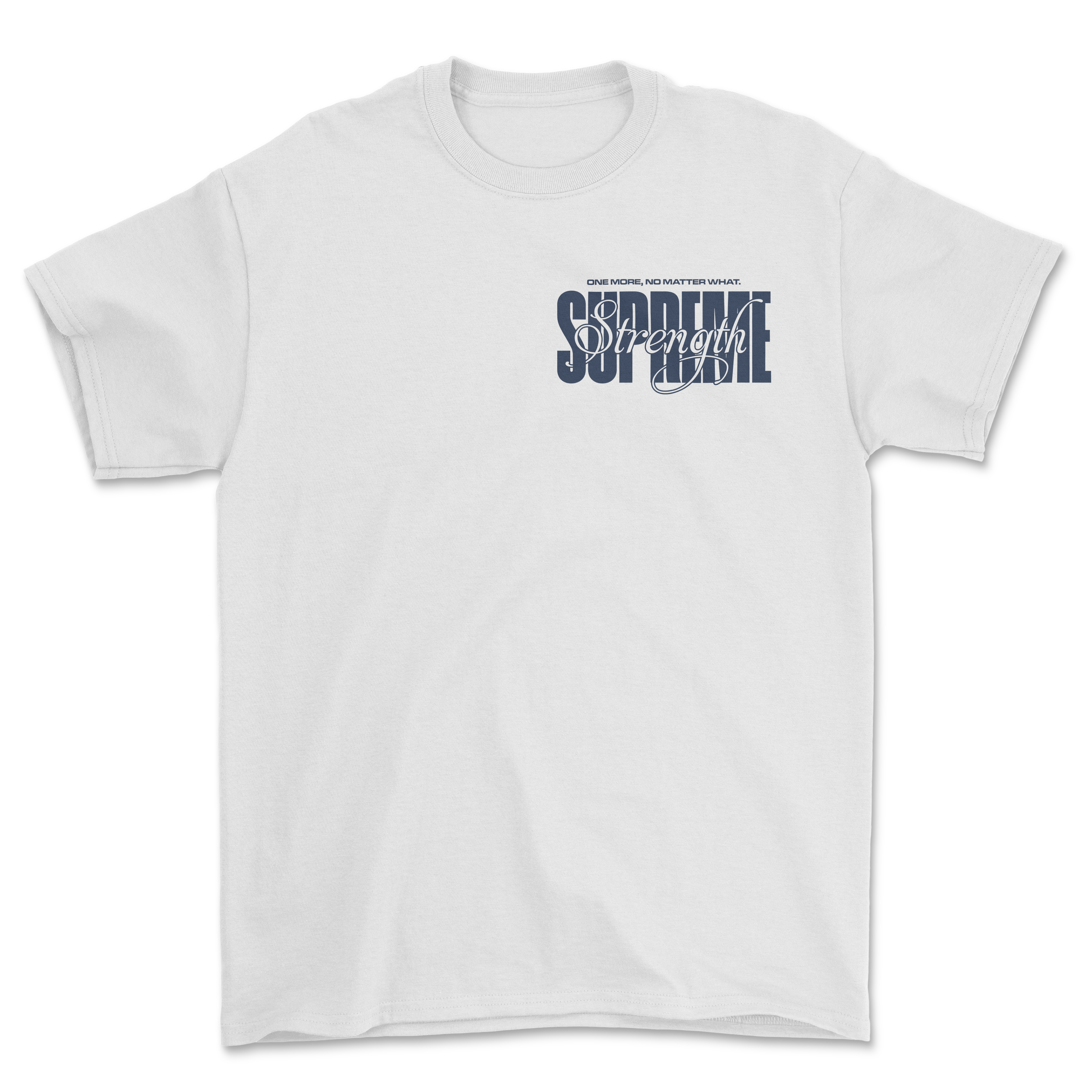
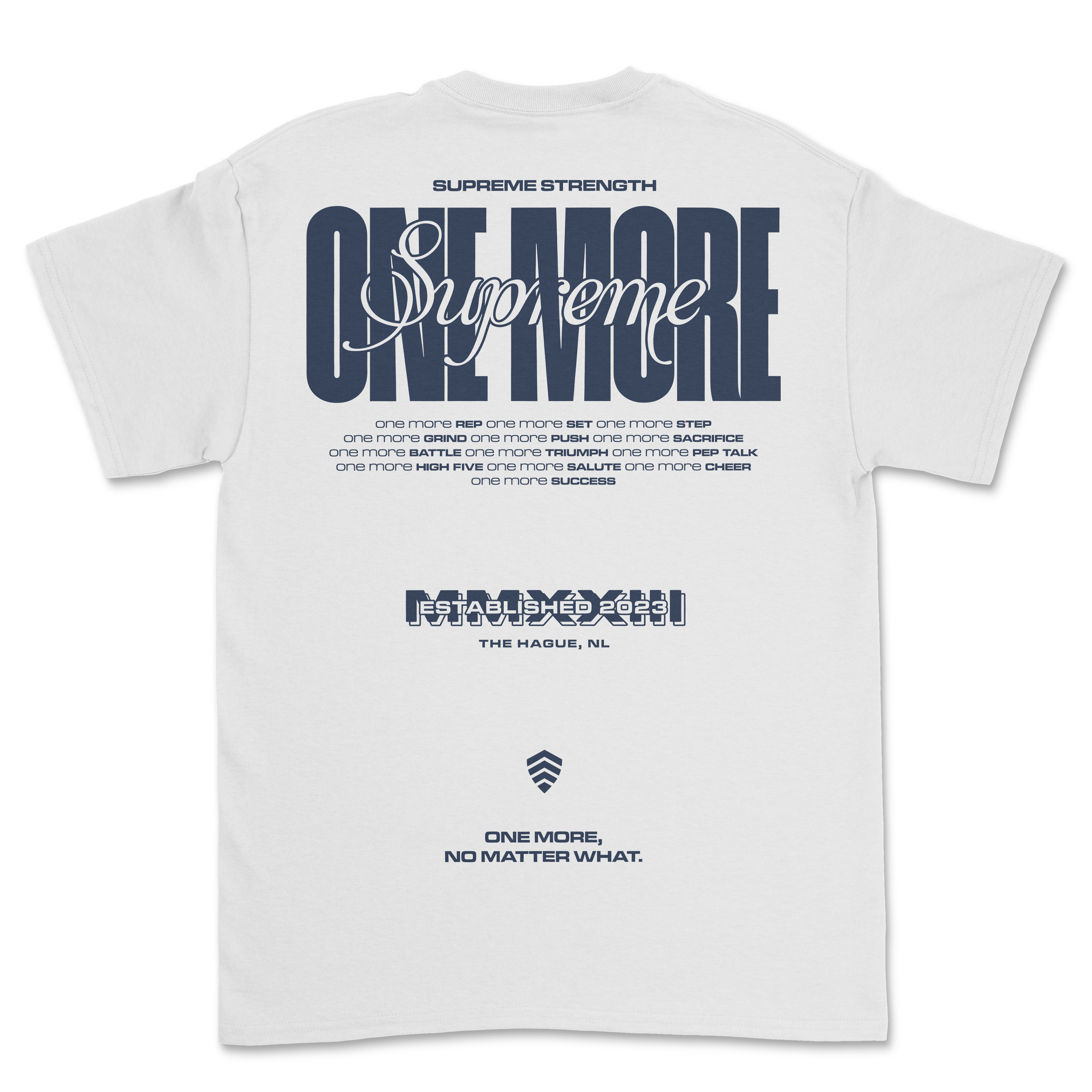
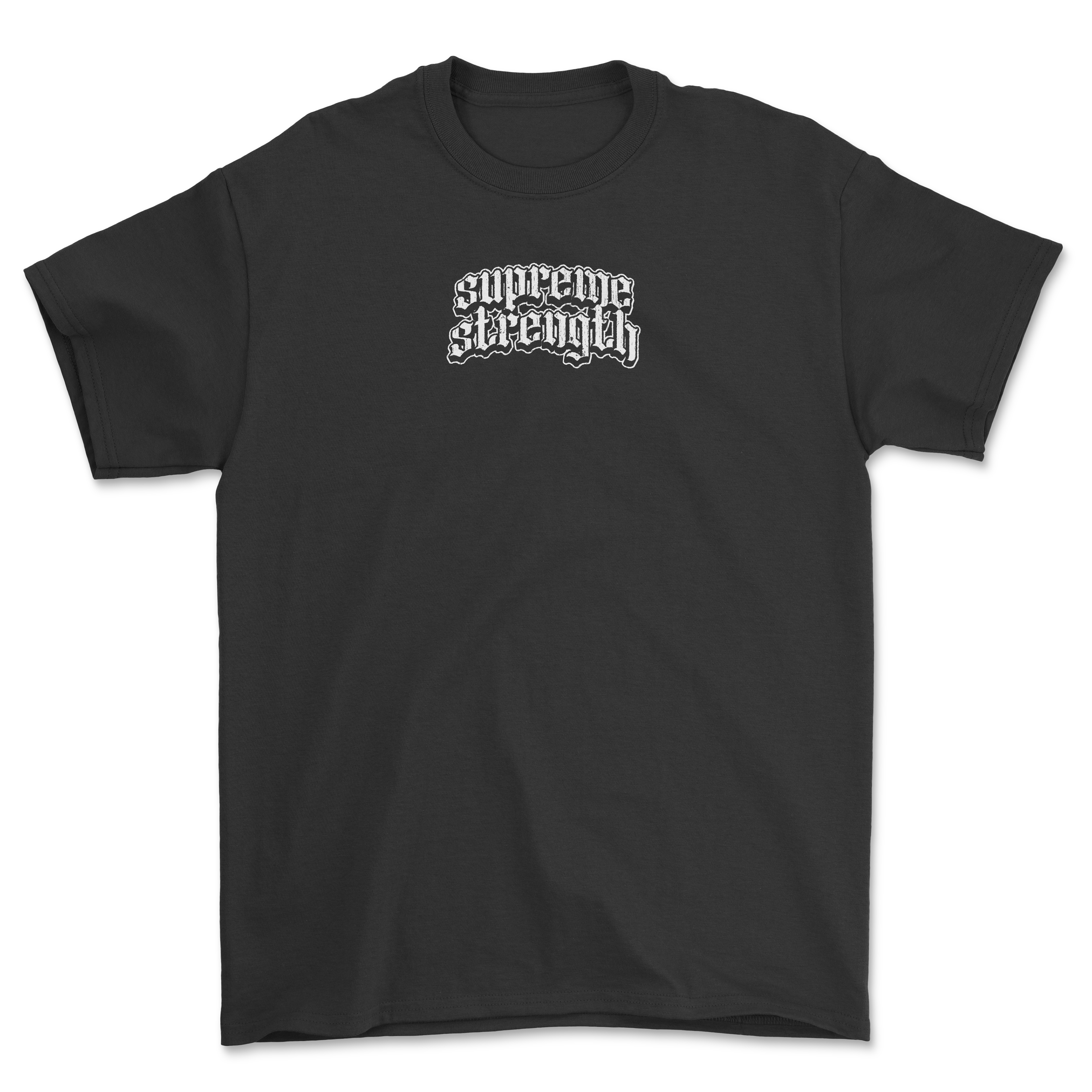
Here I also present the merch designs for the first batch of merch for Supreme Strength. A well established name in the powerlifting scene, with high level athletes training in their facility. Two single color merch designs for a white and black T.
A bold condensed type paired with the script creates a stylistic and timeless contrast, forming the base of this piece. These pieces were heavily influenced by streetwear brands. Using big contrasts and bold and blackletter fonts.
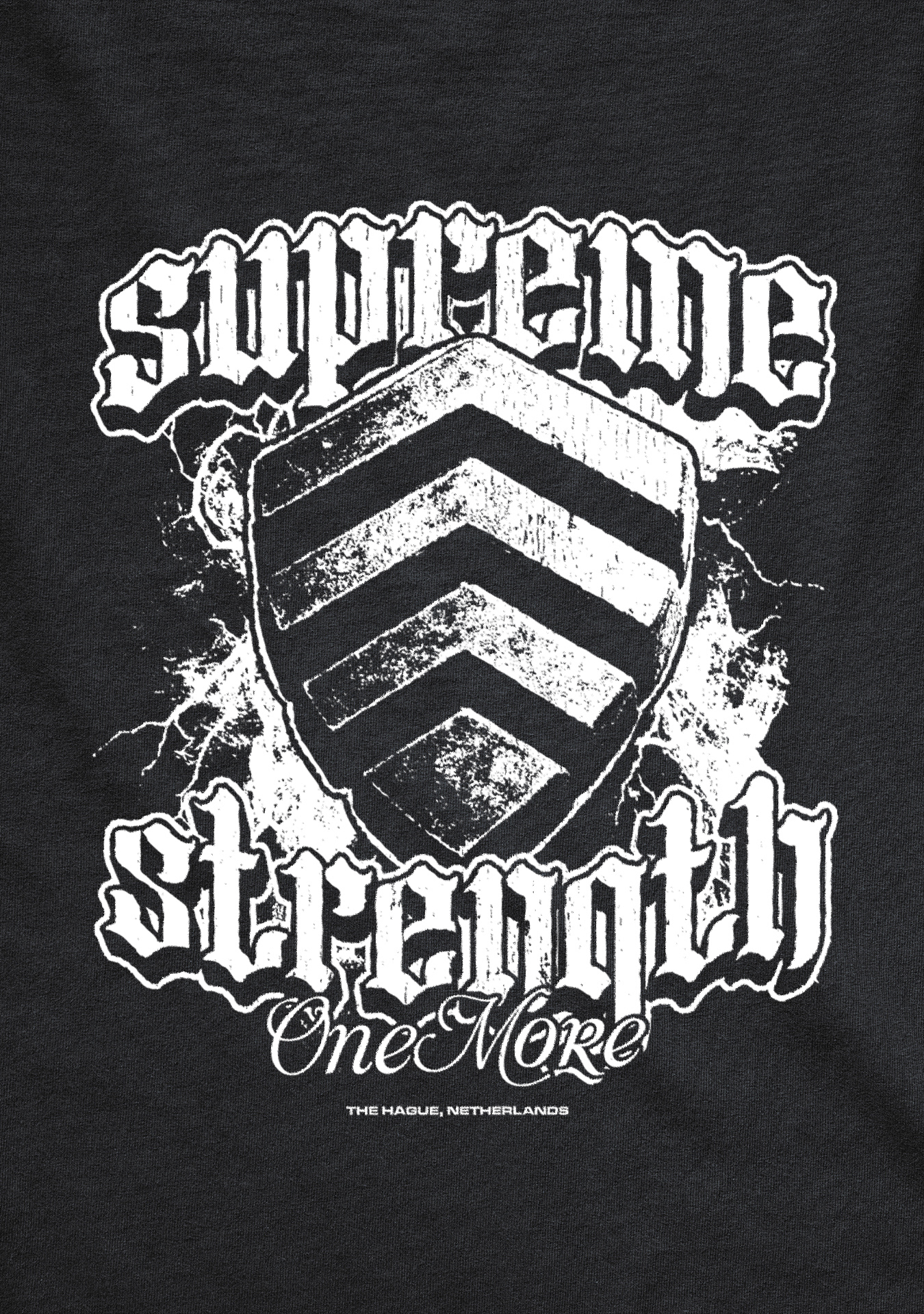
In this design the icon stands as the core of the composition. You know, just to like, imprint the icon into your brain so you don't forget.
To create some literal depth I put this in a 3D perspective. I grunged it up using a lot of texture to get that gritty streetwear look.
It features a custom blackletter style font that goes really well with the overal vibe of the piece. Put some lightning in the back to blend it all together, giving it some filling and dynamic.
"One more" is their quote which you can also see on the white T-shirt. It's written in a subtle handwritten font to create contrast with the main bold font to create hierarchy.
Overall really happy with how it turned out.
To create some literal depth I put this in a 3D perspective. I grunged it up using a lot of texture to get that gritty streetwear look.
It features a custom blackletter style font that goes really well with the overal vibe of the piece. Put some lightning in the back to blend it all together, giving it some filling and dynamic.
"One more" is their quote which you can also see on the white T-shirt. It's written in a subtle handwritten font to create contrast with the main bold font to create hierarchy.
Overall really happy with how it turned out.